
Design your gallery
Choose a cover, fonts, photo grid and colour theme for your event gallery. Changes save automatically.
On this page10 sections
The Design tab controls what guests see when they open your gallery: the cover, the fonts, the photo grid and the colours. Every change saves by itself, and you can check the result in the preview as you go.
Before you start
- An event with some photos uploaded, so the preview looks real.
- A cover photo as a JPEG, PNG or WebP file. A wide (landscape) photo works best on computers.
Note
There’s no Save button. Each change saves automatically (you’ll see Saving… then Saved). If your event is already published, guests see the new design straight away.
Open the Design tab
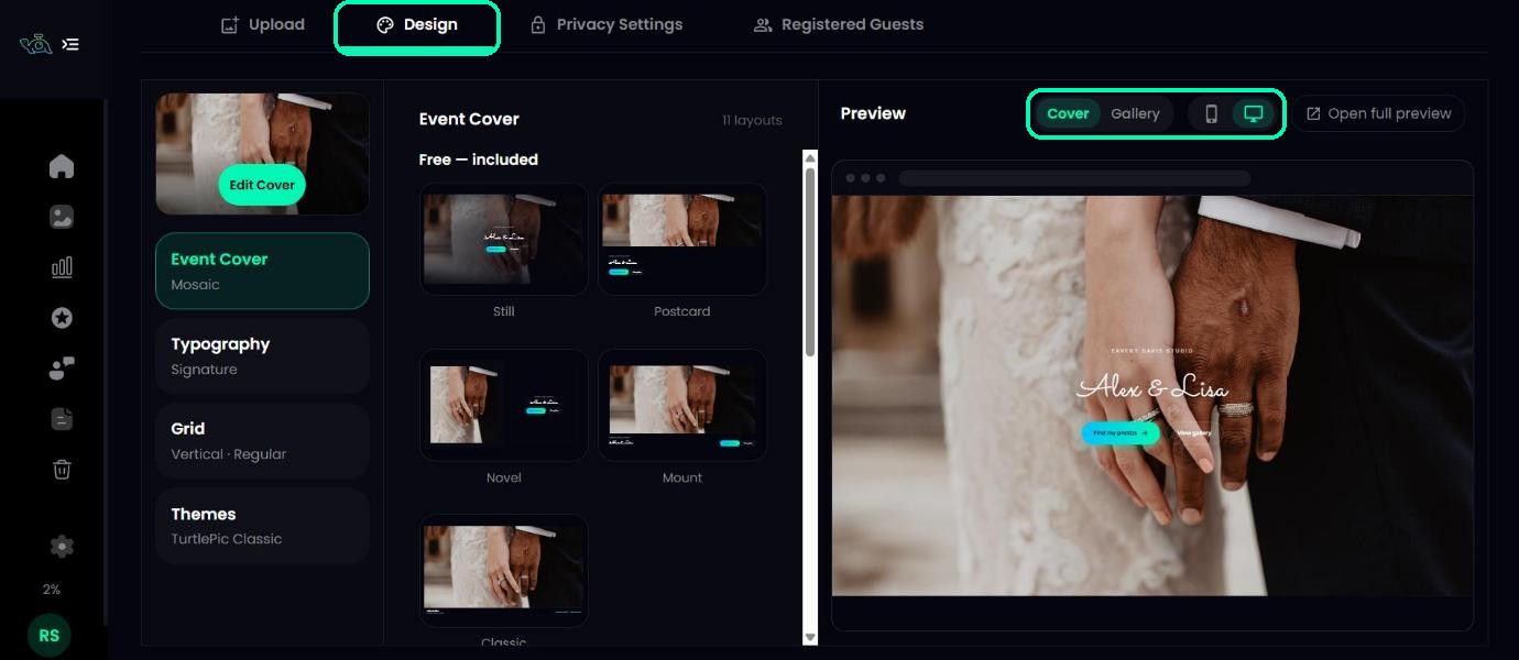
Open your event and click the Design tab. The screen has three parts: the design sections on the left, the options for the selected section in the middle, and a live preview on the right.
Above the preview, switch between Mobile and Desktop, and between the Cover page and the photo Gallery, to see each view the way guests will.
Add your cover photo
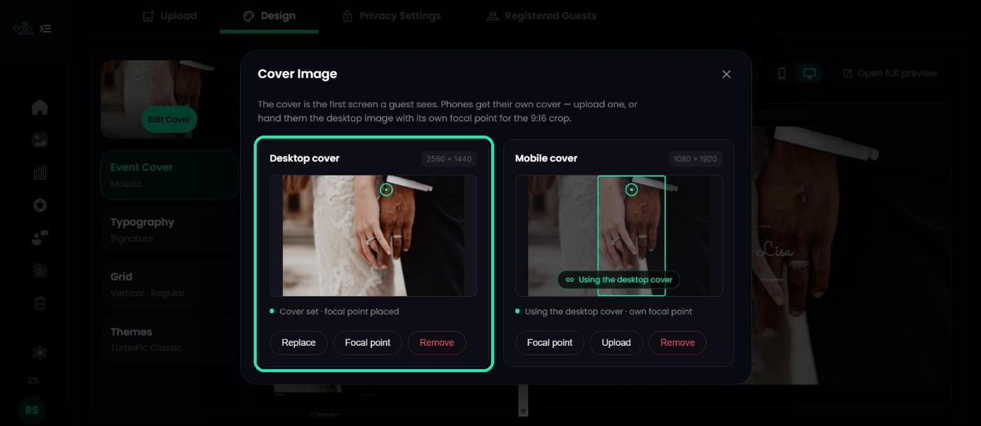
The cover is the first thing guests see. At the top left, click Upload Cover (or Edit Cover if you already have one).
- Under Desktop cover, click Upload and choose your photo.
- Under Mobile cover, click Use desktop cover, or upload a separate photo for phones (a tall, portrait photo works best).
- Click Focal point and drag the dot onto the part of the photo that must always stay in view, such as the couple’s faces.
Tip
Use Replace to swap the photo later, or Remove to take it off.
Pick a cover layout
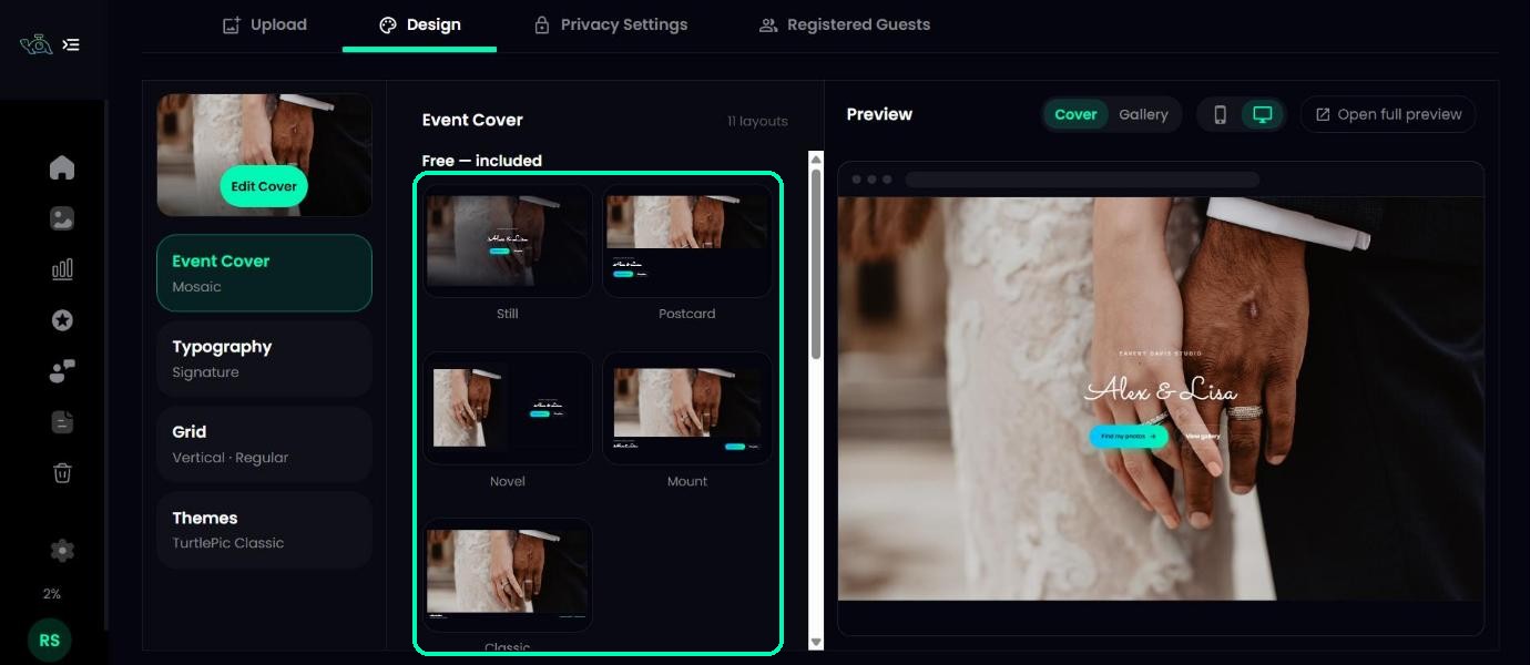
Click Event Cover and choose one of the 11 layouts. The preview updates as soon as you click one.
- Free — included on every plan: Still, Postcard, Novel, Mount and Classic.
- Premium layouts on paid plans: Overture, Mosaic, Letterform, Filmstrip, Print Stack and Aurora Float.
On the Free plan you can still click a Premium layout to see how it looks in the preview. To use it on your gallery, upgrade to a paid plan.
Note
A few layouts use photos from the event itself, so they need a minimum number: Mosaic needs 12 photos, Filmstrip 8 and Print Stack 4. You can still preview them before then.
Choose your fonts
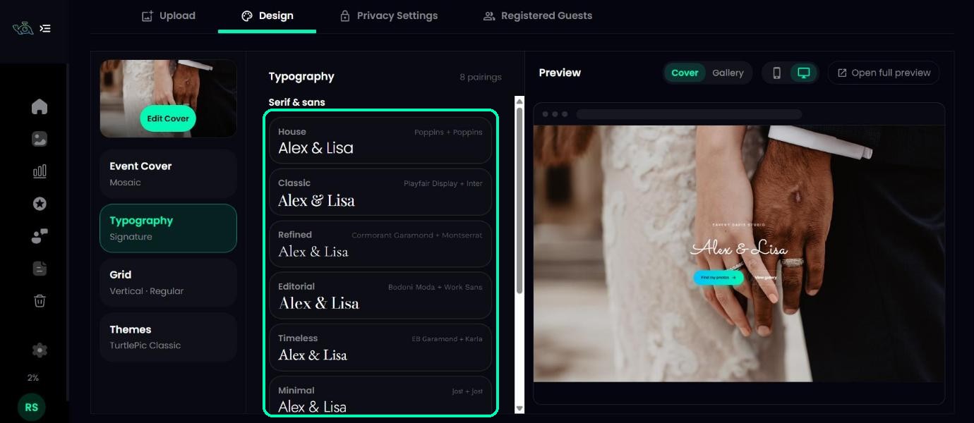
Click Typography and pick one of 8 font pairings. Each option shows your own event name, so you can see exactly how it will look. House, Classic, Refined, Editorial, Timeless and Minimal are clean serif and sans-serif styles, while Ceremony and Signature use a handwritten script, which is lovely for weddings.
Set up the photo grid
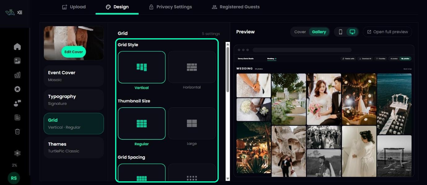
Click Grid to choose how photos are laid out in the gallery:
- Grid Style – Vertical or Horizontal.
- Thumbnail Size – Regular or Large.
- Grid Spacing – Regular or Large gaps between photos.
- Corners – Square, Soft or Rounded.
- Photo Actions – when the favourite and download buttons show on each photo: Off, On hover or Always.
Tip
On phones there’s no mouse to hover with, so On hover shows the buttons all the time.
Pick a colour theme
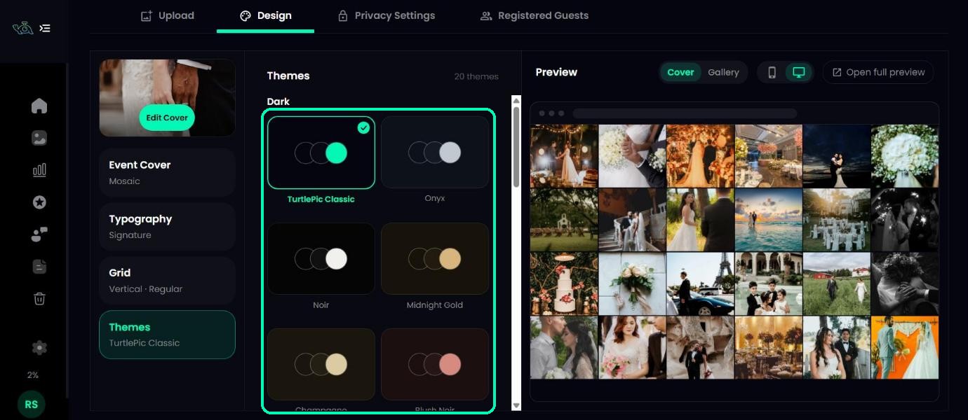
Click Themes and choose from 20 colour themes, 10 dark and 10 light. TurtlePic Classic is the default. Each theme sets the background, the panels and the accent colour together.
See it as your guests will
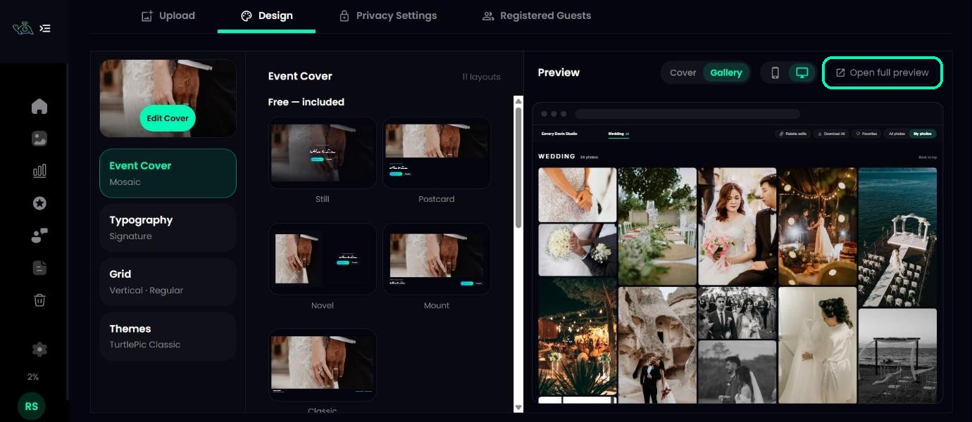
Click Open full preview above the preview. Your gallery opens in a new tab, exactly as guests see it, with the latest saved design.
Where do the logo and watermark come from?
Your studio logo and watermark aren’t set on the Design tab. They come from your Branding settings, so they appear on every event automatically. If you haven’t added a logo, the cover shows your studio name instead.
Was this article helpful?
Your answer helps us improve this guide.
Thanks for letting us know.